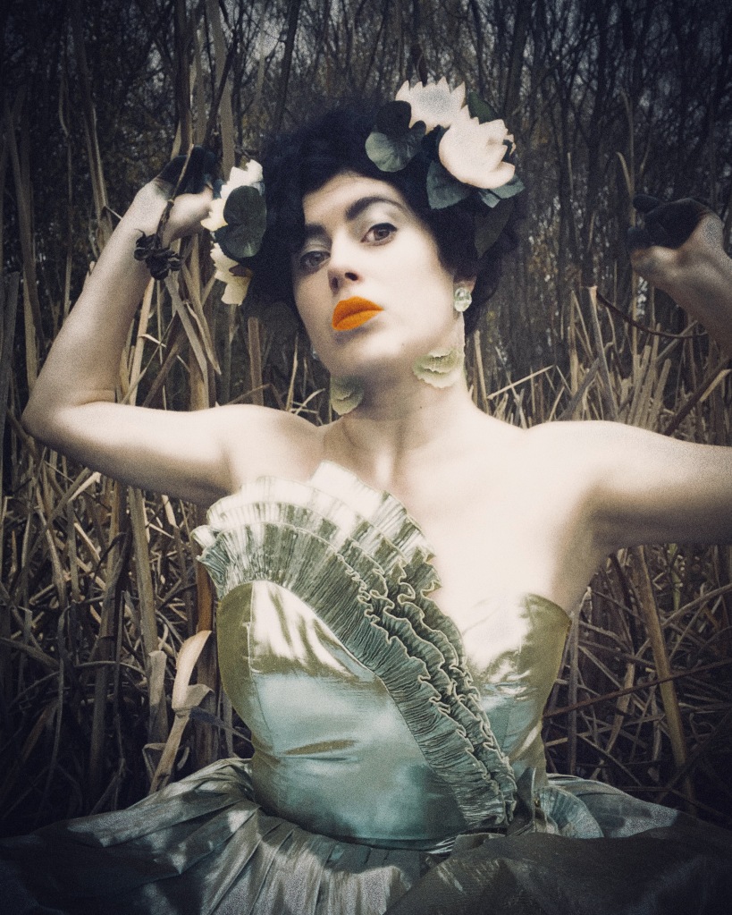
the Fourdrinier editor Jo Manby reviews ‘Ruby Tingle Afterlife’, a multi-media, multi-sensory show reanimating the historic taxidermy collection of The Whitaker, Rossendale as a set of newly imagined dioramas. This personal interpretation of a swamp heaven, which you can go and see until Sunday 10 March 2024, is conceptualised according to the wetland aesthetic of audiovisual artist and performer Ruby Tingle, who is represented by No Such Thing Records and PAPER Gallery Manchester. The idea of heaven on earth (as in, there is no dress rehearsal), integral to the Tingle rationale, becomes articulated in the creation of real-life vivariums in which the dead, stuffed creatures, secluded for so long in the semi-darkness of The Whitaker’s humidity-controlled stores, are given a second life. Tingle worked alongside collections curator Gina Warburton at The Whitaker, together with numerous collaborators. The exhibition, which also includes a large number of exquisite and intricate collages, together with various offerings from the collaborators who worked with Tingle to complete the show, opened on 14 December 2023 with a performance of the single Afterlife, produced by label No Such Thing Records, co-founded and run by Tingle along with Dirty Freud. For the final weekend, 9March, the last Saturday of the show, there will be special animal guests around the museum: The Frog, The Turtle and Ruby Tingle herself.
“I ask if there are any particular makeup brands she uses on her face. ‘No, I’m really cheap when it comes to things like that, I don’t use much, mainly just £2 lipsticks. I used to use more make up and things like face paint for performances and images but now I just keep it simple, and am developing more of a relationship with prosthetics.’ Tingle talks about her delight in finding the prosthetic gills, using eyelash glue to fix them in place, the way they match her platinum metallic bodice perfectly. ‘There are more elaborate versions that I’ll go onto use,’ she says.
“I ask about the type of makeup she uses to colour her fingers in the videos – green fingers, charcoal grey fingers: ‘I accidentally dye my fingers when I use dyes on fabric and paper for the collages,’ she laughs: ‘Brusho dye – that crystal colour stuff, comes as a powder you add to water and it dyes everything in sight.’ It’s similar to magic stains in fantasy fiction too, she says, when someone ends up with colourful fingers after casting spells.
“When the exhibition opened in December, with Tingle performing the new single Afterlife, The Whitaker was sonorous with a waterfall of music emanating from The Old Stables event space. Audio visual feasting was on offer with long range guitars and synthesized droplets of beats and rhythms overlaid by Tingle’s melodious vocals that flow and swirl like ribbons of weed sprinkled by waterlilies. Above the stage, video of swamplands and footage of Tingle accompanied by the mysterious Swamp Reaper, dressed in a black leather coat and a bird skull mask.”
Review first published on the Fourdrinier 1 December 2022
Excerpt:
The group show ‘Paper After All’ is the final exhibition to be staged in the small but perfect PAPER Gallery on Mirabel Street, Manchester. Hidden away behind the railway arches at the back of Victoria Station, the gallery attracted a loyal and loving crowd at the preview on Friday 11 November.
A collaborative project presented first at the Royal Cambrian Academy in Conwy followed by Saul Hay Gallery and PAPER in Manchester, ‘Paper After All’ was devised by asking each of the participating artists to respond to the idea of assemblage – gathering new or found or salvaged elements to create new work especially for the exhibition. It runs at PAPER until 17 December 2022.
‘Paper After All’: a phrase that presages a qualifying statement. Paper, after all. Paper was what it was all about. Among the many wonderful pieces of work in this exhibition is In the car talking to tiktok (2022) by Caspar White. It is lit up against the PAPER Gallery blue wall by a single white candle attached to the painting on a bespoke metal bracket. In this simple, unadorned manner, the element of fire brings to life an artwork directly inspired by the image of a TikTok streamer. The candle flame imparts a spiritual aura while at the same time achieving equivalence with the artifice of screen light that would have illuminated the original video.
The paper that White’s painting is made on is held at a short arm’s length from the element that could destroy it, a reflection perhaps on the volatile, sometimes critically damaging potential of viral social media that young people like the subject of In the car talking to tiktok hold in their hands. Paper as a material becomes as susceptible and vulnerable as our own physical and psychological well-being. But at the same time as strong, as expressive, as resilient and as meaningful.
A review by Jo Manby of Barbara Walker’s major exhibition, Vanishing Point, on show at Cristea Roberts Gallery in London until 23 April 2022, with a range of works on paper combining blind embossing with graphite, plus a large-scale charcoal drawing occupying one wall of the gallery.
“In the huge, impressive wall drawing, four Black figures, all from different paintings, are depicted free of context. It is a dynamic, questioning work. Each face is looking at something, but it is unclear at what. With the white figures gone (subsumed by the gallery wall?) the Black figures are left to redefine their own identities.
“Thinking of the title of the exhibition, ‘Vanishing Point’, perspective has shifted 360° by the time the viewer reaches the four small works adjacent to the wall drawing. Here, the finery is obscured by tracing paper-like mylar. It’s like saying, we know you had all this finery, but we’re not interested in that. We’re interested in the other person in the picture. Walker recalls visiting museums and galleries as a child and noticing the absence of Black people in the portraits she was seeing: ‘…art school provided me with the important opportunities to think about how as an artist I had the power to push back, and to create images other than the nasty corrosive caricatures of Black people frequently peddled by the mainstream media and dominant culture.’”
Double-Tongued Knowability, 1994, DayGlo, nightglo, UV and interference acrylic on canvas, 215 x 306.5cm, Walker Art Gallery
Jo Manby speaks to John Moores Painting Prize winner and PAPER Gallery artist David Leapman about seminal moments, DayGlo paint and Assyrian friezes.
David Leapman is a painter of enchanted, mystical works of prolific script-like mark making, visual conjuring tricks and philosophical ponderings. I’ve found his work beautiful and thought provoking since coming across it at PAPER Gallery four years ago, so it was an honour to speak to him about his process on the phone from his home in Los Angeles.
London born and LA based, Leapman is a winner of the Liverpool John Moores Painting Prize (first prize in 1995 and prizewinner 1997). While discussing his work, Leapman referred to a pivotal moment in his working life – 1 January 1983 – when he began his career as an artist in earnest:
‘There was a new beginning after art school,’ he says; ‘something different: me as an unsupported artist. It was the reason why I began to pare down to bare canvas and monochromatic line.’ He felt that, if colour was removed, ‘you took out all the distraction and were left with the bare roots of ideas and the bare physicality of the work.’
Over the course of his career, Leapman has amassed a huge pool of monochromatic drawings in which he has developed a pictorial language that ranges from cursive, linear articulations to personal signs and symbols. The drawings are an essential part of his creative process, yet, until relatively recently, were ‘a private resource and for me only.’
He explains, ‘For nearly forty years I have been making small gold line drawings on paper. They have become an inexhaustible source of important information for making my paintings on canvas. They are the place where my ideas formulate and emerge.’ Yet, gradually, ‘although the work on paper philosophy continues to be a private process to achieve unlimited experimentation, the increasing use of other materials more associated with my work on canvas has made me more comfortable showing paper work.’ During the pandemic, Leapman continues, ‘I have made almost exclusively work on paper, so I expect to exhibit some of this work in the future.’
1983 came to symbolise a kind of rebirth for the artist, and rebirth became an important theme in his work. It was at this time that the some of the imagery he was using diverged into gendered archetypes. His work often contains ellipse shapes with a young figure emerging, ‘like an adolescent coming out of a womb’, such as in Protective Cell No.1 (1983), or a figure embarking on a journey, as in Intrinsic Compulsion – Christian Scaling the Hill of Difficulty No.3 (1985).
Variations on a headless crawling figure, connected to the idea of rebirth (as in setting out on a journey), reoccur in later works, such as The Burden Holder (2006-08). The same figure is present In Out of a Narrow Place(2009), with a feast of wine, bread and cakes on its back. His continuation of the theme of rebirth, as celebrated in the title Painting My Renaissance (2021), is typical of his consistent pooling and developing of ideas.
David Leapman, Painting My Renaissance , 2021, watercolor and gold ink on paper, 19x28cm
Another important recurring symbol in his work is the pit – a horizontal ellipse of the same type – which appears as a circular sinkhole-like diagram in early works such as Treasure Hunting No.3 (1985), then again later, in Frictionless Progress (2005) or Outward Walls (2021). ‘A simple analogy of the pit is how complex it is to think about what it is you are trying to communicate as an artist.’
A second crucial change in Leapman’s work came during the early 1990s, when he began to add small blocks of intense colour to his raw canvas paintings. By 1992, DayGlo paint became available. ‘Through the course of ten years, I’d now come to understand enough about what I was doing – it would be for a good reason.’ His first-prizewinning entry to the Liverpool John Moores Painting Prize 1995, Double-Tongued Knowability (1994), is painted in DayGlo, nightglo, UV and interference acrylic on canvas. Since this time, colour has become an essential element in his work; one which he evidently enjoys experimenting with.
After a time of heavy reliance on gold line, Leapman recalls: DayGlo ‘felt exotic and unusual.’ It opened a portal of new possibilities, as if merely contemplating it challenged the depths of his perception. He began to frequent the famous paint store, AP Fitzpatrick, down the road from where he was living in Hackney. The proprietor offered ‘weird and wonderful pigments.’ Leapman takes a tube from a shelf as he talks on the phone and reads the label, ‘semi-opaque brown glass’ – a pigment intended for enameling.
From there, Leapman found out about Georg Kremer, who he describes as ‘a kind of mad scientist from Germany and a manufacturer of weird paints.’ Kremer produces concoctions such as ‘Pearl Lustre Mira Magic Turquoise Pearlescent Kremer Pigment’ and ‘Gold-Copper Mica Flakes’. Each product listing on Kremer’s fascinating website includes recipes and tips for artists using these raw substances to make their own paints, something which, in the 1990s, Leapman also began to do. ‘It was very experimental, and I was only concerned with how it looked and how it handled, not how it lasted,’ he explains.
He used glass additives that came in flake form, manipulating the structure of the paint. ‘I wanted the paint to have a certain consistency for my purposes and I used thickeners to reduce the flow.’ In Shadow Reservoir (1988-2002), he used acrylic and mirror flake; in Voyage (1998-2002), acrylic and coloured glass; in Keepers of the Night (2005), luster pigment and cristalina in grey and lilac to supernatural glittering effect.
David Leapman, Keepers of the Night, 2005, luster pigment, cristalina and acrylic on canvas, 110x170cm
There are ambiguities in Leapman’s work, whether in terms of pictorial space and depth, subject matter, or philosophical angle of inquiry. I thought his work was partly inspired by Japanese and Chinese scroll painting, but he professes instead to a more general attraction to flatness in art. At St Martin’s he made drawings and paintings of Assyrian friezes at the British Museum. The museum’s gypsum bas-relief wall panel depicting the Battle of the River Ulai has a consistently active surface tightly packed with figures, horses, palms, weaponry and inscriptions. This dense, flat articulation occurs in many of Leapman’s works, such as Outward Walls (2021), where the entire picture plane is occupied by fluent mark-making.
David Leapman, Painting Outward Walls, 2021, watercolor and gold ink on paper, 19x28cm
Later, he became interested in the early Renaissance. Particularly in the works of Piero della Francesca, Bellini and Mantegna, where ‘there is a sense of switching from 3D to flatness and I’m very intrigued by that,’ he describes. ‘The idea of constructing through blocks of colour: you could make them into sculpture, but they’d be inferior. There’s an impossibility of the painting becoming 3D. It lives in its own flat realm.’
Another recurring motif comprises self-contained entities found in works such as Keepers of the Night (2005), where insoluble pictorial enigmas float like kept secrets or locked treasure chests, each a different configuration of colour and form. In Unverified Petal Thinkers (2006), accretions as intense and luminous as nightclub body paint emerge from a background of indeterminate scale, radiating a sense of wholeness and permanence. Some have an animistic quality, evoking limbs or faces; others are like complex flashes of light – starbursts, fireworks, flares, electrical charges.
David Leapman, The Fullness of Being and Absolute Nothingness, 2005, DayGlo and acrylic on canvas, 50x60cm
Leapman talked about these entities as they appear in the painting The Fullness of Being and Absolute Nothingness (2005), adding ‘the essence of the title is exactly the dream of what I want my work to be about.’ It’s a translation of a phrase from Kabbalist and Hasidic thought, a philosophical notion which describes the contradiction fundamental to the human condition. The 18th century Hasidic rabbi Dov Ber of Mezeritch wrote: ‘…one should think of one’s self as Ayin, and that “absolute all” and “absolute nothingness” are the same, and that the person who learns to think about himself as Ayin will ascend to a spiritual world, where everything is the same and everything is equal: “life and death, ocean and dry land.”’
Leapman grew up in a North London Jewish family, part of the Liberal Jewish movement. As he says, ‘numerous conversations with Stuart Morgan, the art critic and writer, enabled me to acknowledge the presence of my cultural identity even in my most abstracted work.’ These bursts of colour look like cells, I suggest; complete and whole. ‘Yes, if you take a cell, it’s self-contained. It contains everything needed for life.’
Generally, Leapman describes his imagery as concerned with finding a way of working that deals with ‘an authentic experience of life.’ Expanding on this, he adds: ‘These images are rooted in me as a person – my culture, my history. My goal is always that, if they’re successful, they’re universal. But they come from the extremely personal.’ His John Moores 20 prizewinning work Existence Harness (1997) was, he recalls, an evocation of ‘something that contains the whole universe.’
In terms of gathering ideas for paintings, I wondered whether Leapman sometimes starts with a verb that relates to a thought process, since there are titles for works that refer to ‘notifying’, ‘inclining’, or ‘deducing’, among many others. ‘The most obvious way to think about it is I don’t start out with a title. But they are very important to me. I used to say they’re a flavour of or the indication of the work.’
One of my final questions as we chatted was whether Leapman had ever been stuck for ideas. I couldn’t imagine it; with its multiple themes and prolific resource of drawings, his work seems to flow in a constant stream. The ‘searching for that new image and feeling like you don’t know where to begin – in my mid-20s that made me feel quite anxious. But now I kind of really treasure that type of period because it makes you struggle, and it often turns out to be very productive. Sometimes you finish a painting and get a sense of real clarity. The next painting is really obvious. That painting can become quite irrelevant. And then you venture into new territory. It’s tough to get there but far more satisfying.’